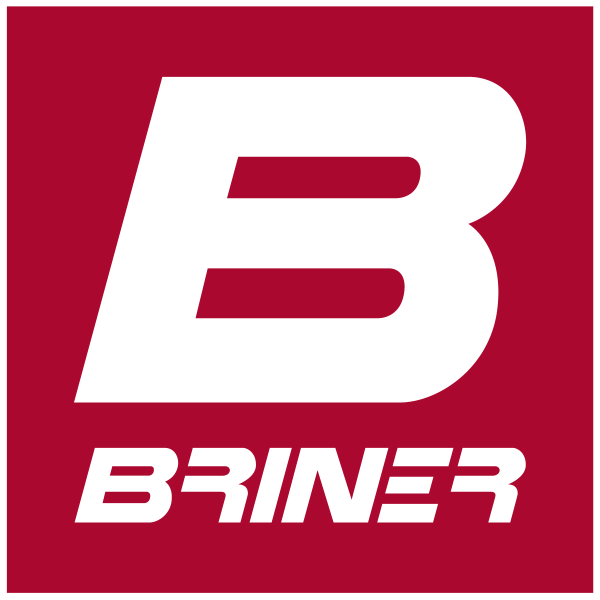
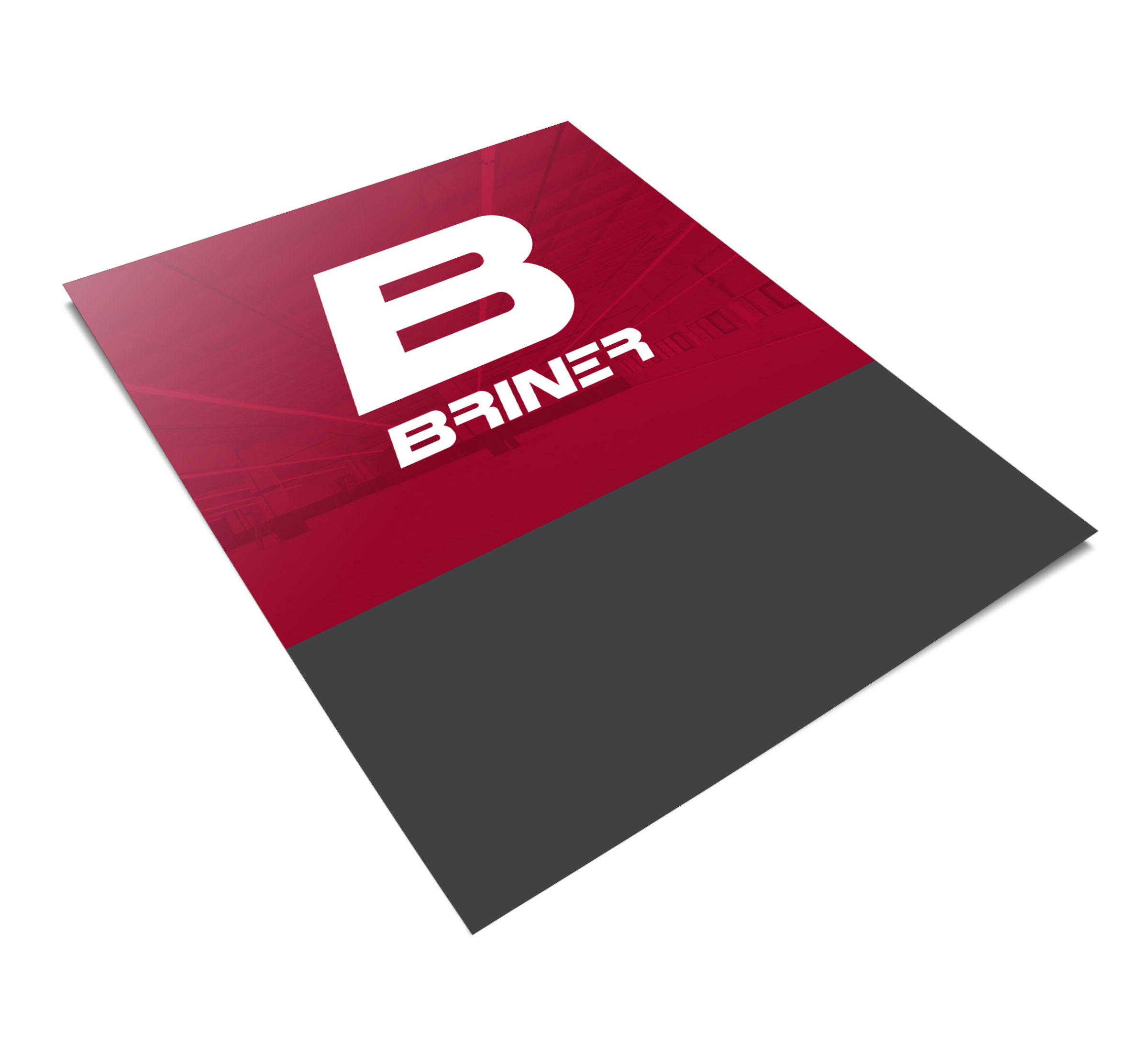
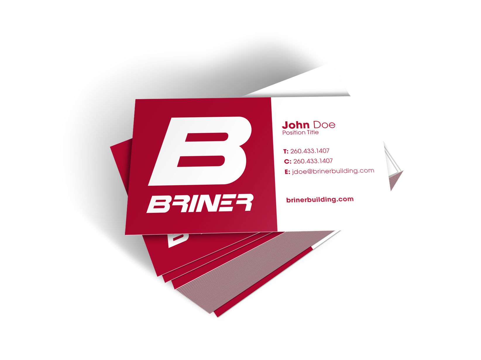
For Briner the objective was to create something that would stand out in any scenario it would be seen. Due to the industry they work in, they have several areas on boards around the worksite letting people know who is doing the construction. Now that I’ve created something that can live on its own and is recognizable in the greater local area it’s always obvious where they’re constructing new buildings.
I didn’t want to stray too far away from their old logo, so I modified and fixed the structure of their previous logo, all the while, updating it for a more modern look. I also introduced the “B” as a symbol to be large and easily recognized from the street.